Why I Built Milestone Studio
A simple tool to create clean, shareable milestone cards without opening Canva every time.
A few weeks ago, I started sharing my milestones more seriously.
Follower count.
MRR.
GitHub stars.
The usual stuff.
At first, I was just posting text.
It worked… but not really.
So I tried turning one of them into a simple visual card.
Nothing fancy. Just a big number, dark background, clean layout.
That one post performed way better than anything I’d shared before.
Same milestone. Different packaging.
After that, I kept doing it.
Every time I hit something worth sharing, I’d open Canva.
And every time… it took longer than it should.
Not because it was hard — just a lot of small, annoying decisions:
Tweaking contrast so the number actually pops.
Picking a gradient that doesn’t look cheap.
Resizing text over and over until it feels right.
Twenty minutes gone. For something that should take two.
After doing this enough times, I started noticing a pattern.
The cards that worked best weren’t complex.
They were actually the simplest ones:
one strong number,
high contrast,
almost nothing else.
And consistency mattered more than creativity.
Using the same style again and again made the posts feel recognizable.
One format I kept coming back to was showing progress, not just a number.
Current milestone in the center.
A faded “next” above.
Previous one below.
It’s subtle, but it makes the whole thing feel alive — like you’re watching something move.
Eventually I got tired of opening Canva for the same thing every time.
So I built a small tool for myself.
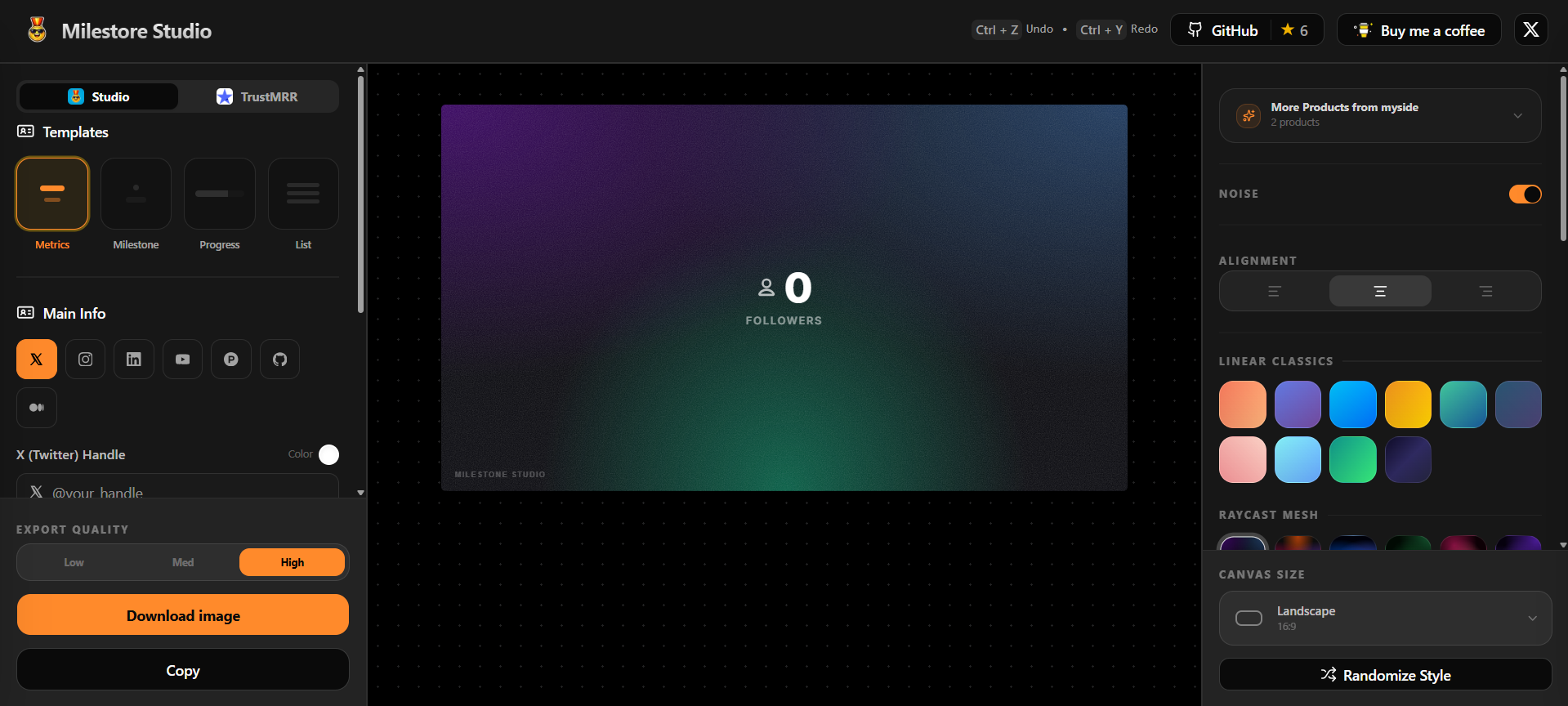
Just something that lets me drop in a number, pick a style, and export.
No overthinking.
That’s how Milestone Studio started.
If you’re sharing milestones regularly, you’ll probably run into the same friction.
You can try what I’ve been using here:
https://milestonestudio.nikhilsai.in
But honestly, the tool isn’t the main thing.
What changed things for me was this:
When you make your progress visible,
people don’t just read it — they feel it.